Tracking retention with Leanbase
Users Who Come Back: Tracking Retention with Leanbase
Once your integration is live and activation is defined, the next step is understanding how well your product keeps users coming back — this is retention.
Retention shows whether your product consistently delivers value over time. While activation signals a first moment of success, retention proves that users continue to find that value again and again. Without strong retention, even great acquisition can’t drive long-term growth — you’ll constantly need to replace churned users just to stay level.
Thinking About Retention
Retention looks different across products.
For a social app, strong retention might mean users return multiple times a week. For a finance or analytics product, once or twice a month might be enough. The key is consistency — users keep returning because your product fits naturally into their workflow or routine.
You can think of retention as the evolution of activation:
Activation event: A user takes a meaningful first action (e.g., signs up, sets up their workspace).
Retention event: The user repeats high-value actions over time (e.g., collaborates with teammates, exports data, or creates reports weekly).
Sustained retention reflects a product–market fit where users not only try but depend on your product.
Measuring Retention in Leanbase
You can measure retention in Leanbase using a Retention Insight.
For example, you might want to measure how many new users return to your product within the first week after signup.
Baseline event
Where measurement begins — such as a User signed up or Workspace created event. You could also start from your defined activation event.
Retention event
A repeat or high-value behavior that signals ongoing engagement — like Session started, Dashboard viewed, or Report exported. You can filter these to focus on specific user actions or features.
Timeframe
Choose your measurement window — from hours to months — depending on your product’s natural usage rhythm.
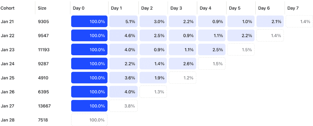
Leanbase then generates a Retention Table, showing what percentage of users return over each time period.
Reading a Retention Table
Each row in a retention table represents a cohort of users who performed the baseline event during a specific time period.
Day 0 is always 100% (everyone who triggered the baseline event).
Each subsequent column shows what percentage of that cohort came back and performed the retention event again.
Dotted lines indicate incomplete data for recent days.
For example: if 9,547 users signed up on January 22, and 2.5% returned by day 2 while 2.2% returned by day 5, Leanbase visualizes these patterns to help you spot trends early.
Planning for Retention
To start analyzing retention, define three simple things:
Baseline event — what marks the start of user activity?
Retention event — what recurring behavior represents engagement?
Timeframe — how long do you expect users to return within?
Then, use a Retention Insight in Leanbase to visualize your retention curve.
If the curve flattens — meaning it stabilizes at a steady percentage — that’s a strong sign your users are finding lasting value and sticking around.