What is Lifecycle analysis?
Lifecycle Insight
The Lifecycle insight visualizes how your users evolve over time — showing who is new, returning, resurrecting, or dormant.
It helps uncover what’s really driving your user growth. For example, you might see strong acquisition from marketing, but if users churn quickly, long-term growth will suffer. This insight helps you identify patterns behind increased churn or decreased acquisition so you can take action early.
Creating a Lifecycle Insight
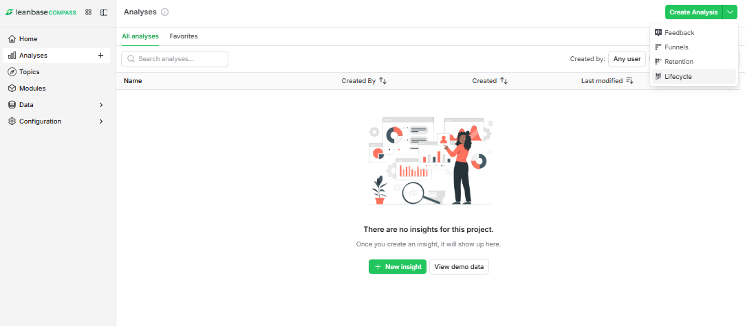
Go to Analytics in the left sidebar.
Click Create Analysis
Select the Lifecycle Analysis.
Configuration
Lifecycle determines if a user was active during your selected time interval and whether they were active in the previous one.
 Users are considered new the first time they are identified (even if they had previous anonymous activity).
Anonymous events are excluded from this calculation.
Events
Start by selecting an event or action that represents user activity in your product.
Choose something users do repeatedly, such as:
Viewing a page
Logging in
Sending a message
For example, in a messaging app, you might define “active” users as those who sent a message within the selected interval.

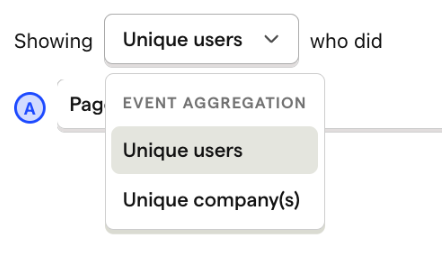
Aggregation Type
By default, Leanbase aggregates lifecycle data by user.
If you have group analytics set up, you can also aggregate by groups instead.
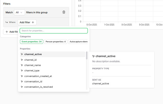
Filters
Add filters to focus on specific user segments or event subsets, just like in other Leanbase insights.
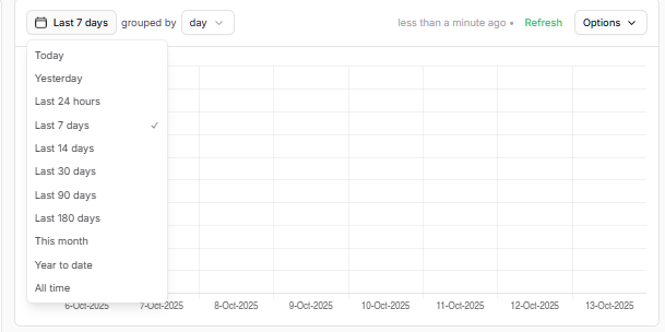
Time Range
You can configure the time range and interval (hourly, daily, weekly, monthly) to match your product’s natural usage frequency.
For example, a messaging app may group by week, since users typically send messages weekly.
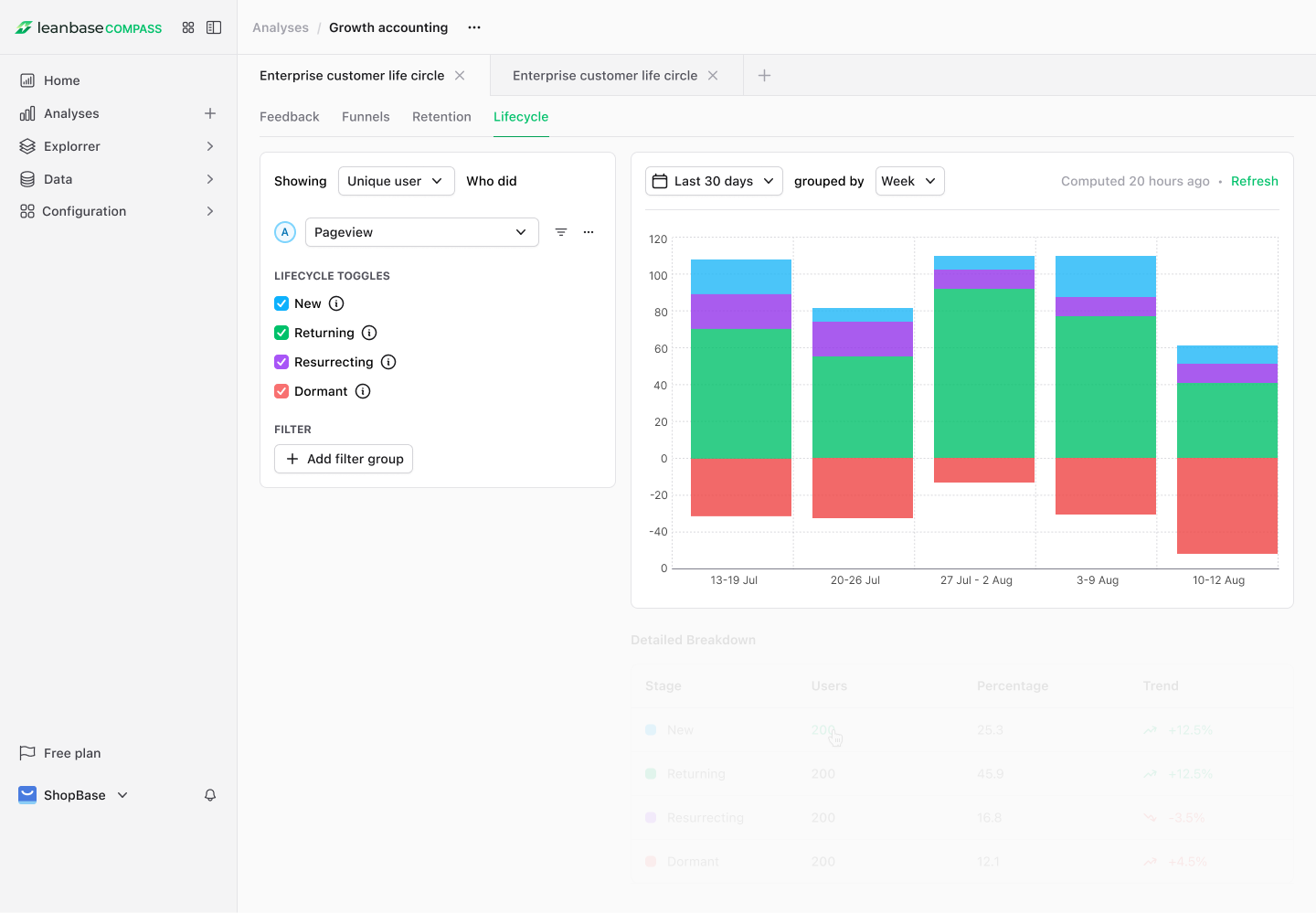
Interpreting the Lifecycle Chart
Here’s an example of a Lifecycle insight:
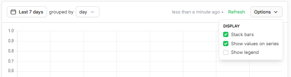
💡 Tip: Click Options → Show values on series to display exact values on the chart.
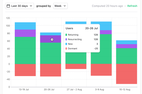
Each color represents a different user state:
Category |
Description |
|---|---|
New (blue) |
Users who became active for the first time during this interval (e.g. created an account and sent a message today). |
Returning (green) |
Users active in both the current and previous intervals (e.g. sent a message yesterday and today). |
Resurrecting (purple) |
Users who were inactive in the previous interval but became active again (e.g. didn’t send messages for 10 days but sent one today). |
Dormant (red) |
Users who were active before but not in the current interval (e.g. sent a message yesterday but not today). |
Everything above zero represents active users; everything below zero represents inactive users.
What to Look For
What you should monitor depends on your product, but generally:
Returning users should stay stable or increase — otherwise you may have a “leaky bucket” problem.
A high resurrecting user count might indicate your time interval doesn’t match user behavior (e.g. users engage weekly but your chart is daily).
If you’re running user acquisition campaigns, check that these efforts reflect as new users in your lifecycle chart.
Follow-up questions to explore:
Are users staying active longer over time?
Which user types are churning — recent sign-ups or long-time users?
You can explore this further using Retention or Stickiness insights.
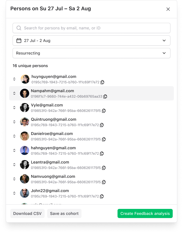
Viewing Individual Users
Click any segment (e.g., Dormant users) in the lifecycle chart to view the users in that category.
From there, you can:
Inspect their event history or session replays
Create a cohort for deeper analysis