What is Retention analysis?
Retention Overview
Retention in Leanbase shows how many users return to your product over time. It helps answer critical questions like:
Are new signups coming back after their first experience?
Did a new feature or UX change improve user return rates?
Which types of users or accounts retain best over time?
Retention insights are essential for understanding user engagement patterns and measuring product–market fit.
Creating a Retention Insight
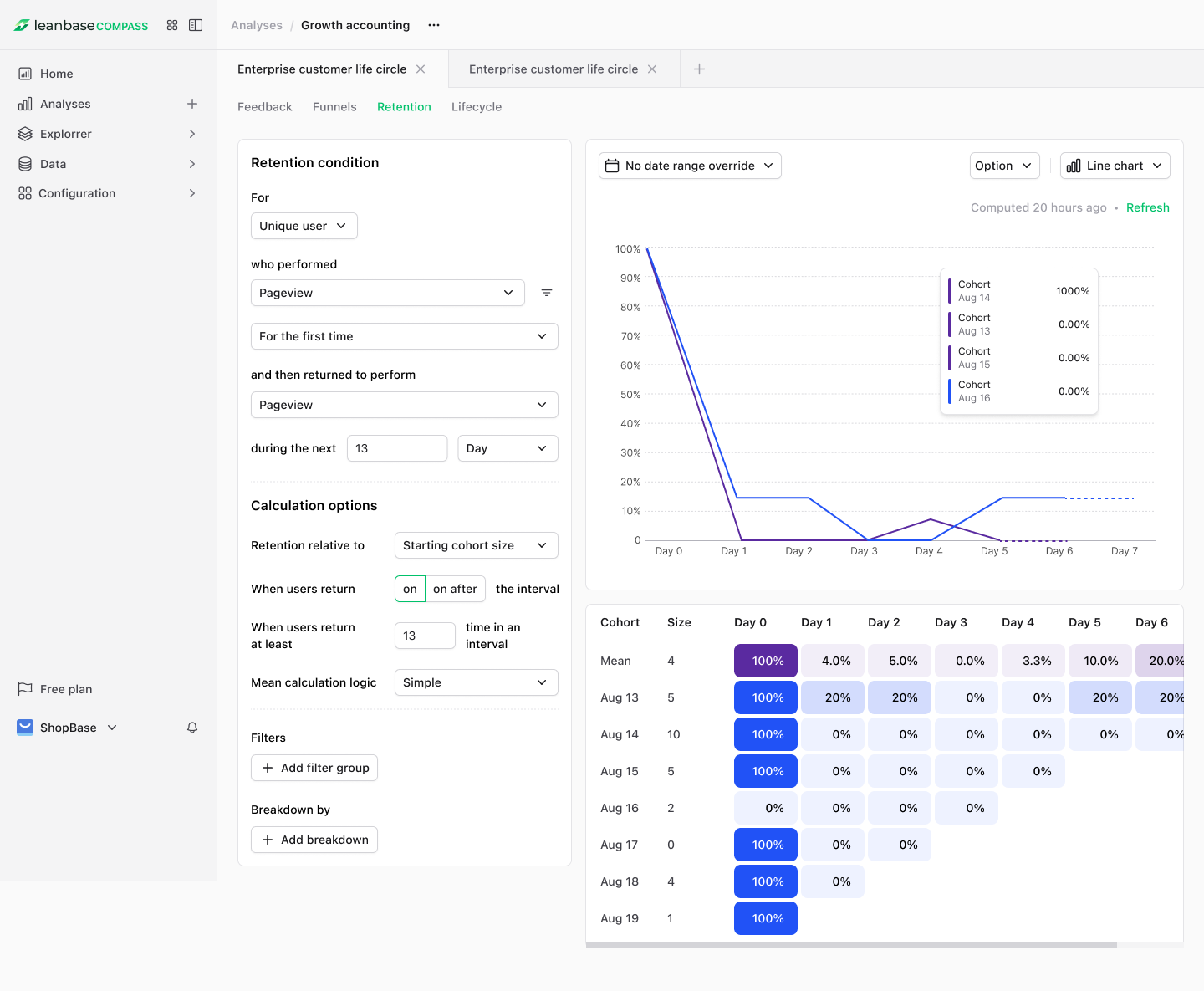
Retention insights in Leanbase work with both events and actions.
When you create a retention insight, you define two things:
Start event – The event or action that includes a user or group in a cohort.
Return event – The event or action that determines whether that user or group was retained.
Often, both are the same event (e.g., “Product Interaction”).
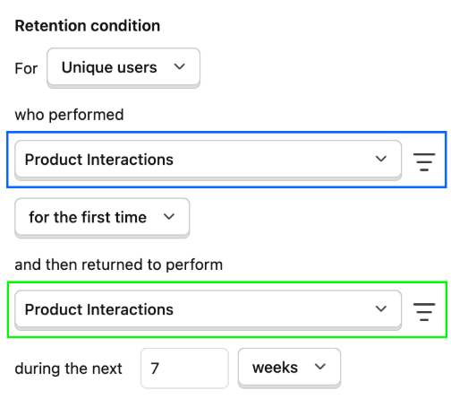
Example:
You might use an action like Product Interactions for both start and return events. You can group by Unique Users and analyze users who first performed this action during a seven-week period.
Advanced Retention Configuration
With Leanbase, you can also:
Analyze group retention – Measure how organizations, teams, or accounts retain users. Ideal for B2B products where not all company users are active.
Define retention periods – Choose any interval (hours, days, weeks, or months). For example, “in the last 12 months” to assess year-long retention.
Apply filters – Use event properties (device, country), person properties (job title, company), feature flags, or existing cohorts.
-
Select retention type –
First-time retention: users’ first-ever occurrence of the start event.
Recurring retention: users included each time they perform the start event within the defined period.
Add breakdowns – View retention by property (e.g., plan type, geography, browser).
Configure advanced metrics – Like relative retention, comparing cohort changes between time periods.
Understanding Retention Insights
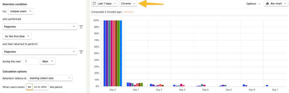
Leanbase visualizes retention data in two ways:
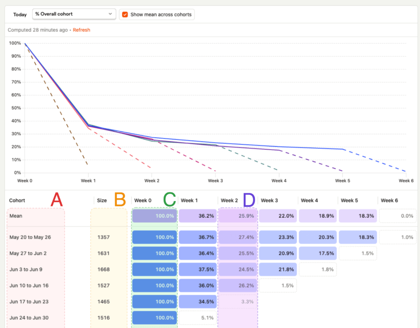
Retention Graph – A line or bar chart comparing cohorts over time.
Cohort Retention Table – Tabular format showing exact percentages and cohort sizes.
By default, all values are shown as a percentage of the initial cohort (“Week 0”).
Table Columns
Column A – Cohort name or time range (e.g., May 20–May 26).
Column B – Size of each cohort (unique users or groups).
Column C – “Week 0,” the baseline where all cohort members performed the start event (always 100%).
-
Column D+ – Subsequent periods (Week 1, Week 2, etc.), showing what percentage of users returned.
Example: 27.4% of the May 20–May 26 cohort returned in Week 2.
Tips for Analyzing Retention
A user belongs to one cohort only (based on their first start event).
However, a user can appear in multiple retention periods within the same cohort (e.g., both Week 1 and Week 3).
It’s possible for a later period to have higher retention if users return cyclically (e.g., weekly usage).
Retention insights track if a user returned—not how often. To analyze frequency, use Stickiness insights.
Ongoing periods display a tooltip (“in progress”) and will update as data refreshes.
Click a retention cell to open a user details modal for deeper analysis of that segment.
Retention Calculation Options
Reference Types:
Period 0 (default) – Percentages relative to the initial cohort size.
Previous period – Percentages relative to the immediately preceding period.
Mean Calculation:
Weighted mean (default) – Accounts for cohort size when averaging.
Simple mean – Treats all cohorts equally regardless of size.
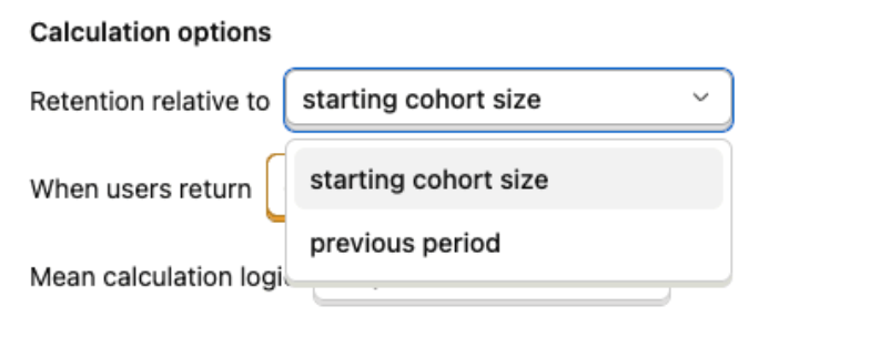
Relative Retention
Two calculation modes:
Starting cohort size (default):
% of users who returned compared to the initial cohort.
→ Example: Day 3 = 25% means 25% of the original users returned that day.Previous period:
% of users who returned compared to the last period.
→ Example: Day 3 = 40% means 40% of those who returned on Day 2 also returned on Day 3.
This helps identify where retention improves or declines most sharply.
Returning Time Criteria
Two options determine which users are counted as “returned”:
On (default): Counts only users who returned during that specific time interval.
-
On or after (cumulative): Counts users who returned on or after that time (e.g., Day 3 also includes Day 4+).
This represents cumulative retention, effectively showing the inverse of churn.
Mean Calculation Logic
Simple: Equal weight for each cohort.
Weighted: Larger cohorts contribute more to the overall average.
Breakdowns
Breakdowns allow you to segment retention by:
Event properties – e.g., browser, device
Person properties – e.g., country, plan tier
Group properties – e.g., organization, team
Each breakdown shows average retention for that property value.
Click a breakdown row to expand and view cohort-level data.
Note: Both start and return events must share the same breakdown value.
Example: If a user starts in Chrome but returns in Firefox, the Chrome breakdown won’t count that return.
Displaying Retention Insights
When saving a retention insight, choose:
Chart Type: Line or bar
Display Type: Show as chart only, table only, or both on dashboards
Retention vs. Stickiness
Insight Type |
Measures |
Best for |
|---|---|---|
Retention |
% of users who return at least once within a given period |
Evaluating long-term engagement |
Stickiness |
How often users perform an event within a period |
Measuring active usage intensity |
In short:
Retention = Are users coming back?
Stickiness = How frequently are they engaging?